My father had a secret stash of Shirley Bassey records. There was a record-player in the house. Mine. It was not a very good record-player. I was eleven and I did not know what hi-fi was. I was into noise, and catchy tunes and syncopations. I had no idea what a ‘Shirley Bassey’ was either, except that it was obviously extremely glamorous and sparkly, could be photographed with its mouth open and got hidden in my father’s bedroom closet—where there was no record-player to play it.
‘Melodica’—sucky instrument one blows into to produce windy notes.
Many years later I learned my father lived most of his life in another house, an apartment he kept in Collingwood, an inner suburb of Melbourne, while I reconnoitred the border of ‘Forest Hill’ and ‘Nunawading.’ His Shirley Bassey records got played—if they were played at all, I never heard them—in Collingwood.
I compensated for the lack of a musical education, from my parents or anyone else, by trying to figure out how musical scales worked with the aid of books and a strange, little keyboard called a ‘Melodica’ (which sucked, even though I had to blow in it). This ‘instrument’ emitted horrifyingly weedy, windy sounds that were supposed to be musical notes.
Children are lucky if their parents have the good sense to force them to learn a musical instrument. Even if the knowledge does not stick or the child has no talent, there are important ideas and impressions that are planted in the mind by a musical education.
Children are lucky if their parents have the good sense to force them to learn a musical instrument. Even if the knowledge does not stick or the child has no talent, there are important ideas and impressions that are planted in the mind by a musical education. Exactly what these ideas and impressions are is difficult to say.
One of them, for example, might have something to do with scales. Leave aside the discipline and patience needed to practice them: every distinct culture has a distinct musical scale that is a framework upon which all its music is built. There is a Chinese scale, an Arabic scale, a Greek scale, an Indian scale, scales that are equally tempered and scales that are not. Discovering these facts through musical exploration changes a person’s understanding of what culture is and how culture shapes perception.
I listened to Mozart, and graduated to Bach. I had no idea what a Sex Pistol was, or a Clash; David Bowie, The Ramones, The Osmonds and The Bay City Rollers were all just words.
One of the popular boys in high school, who seemed to know things the unpopular boys did not know, started to mock me and gave me the nickname “Stevie Wonder”. His mockery was so gentle and, I see in retrospect, so complimentary that I wonder now whether he might have fancied me. Whatever his motive, my new nickname introduced me to the artist who convinced me that contemporary music was worth listening to. Motown. It was fresh air.
Wonder was twenty-three when he made the live studio promotional video for a new album and recorded ‘All in love is fair’. What a voice he had! Conversational and easy-going when singing quietly, it could suddenly unleash tremendous emotion. Wonder’s version of his own song is a study of contrasts between beautiful vibrato, playful melisma, and striking crescendos.
Shirley Bassey singing ‘All in love is Fair’.
Other singers, mainly women, took up this song very quickly, and made it their own. Shirley Bassey renders it in a sassy, wise-ass style in which her jaw really looks as though life is punching it crooked as she sings. Barbra Streisand performs it straighter, as though whispering a lesson in life and love right in your ear. Carmen McRae’s version is jazzier, seeming to plumb darker notes, but all the while keeping the melodic line under tight control. Dionne Warwick’s is the saddest version and, just by a little, the slowest.
These other artists are not merely channeling Wonder’s song. Each version seems like something completely original that is made out of the singer’s own life.
The great French cellist Paul Tortelier said of musicians, “We are fortunate. We know about happiness.” Note, though, that he does not say they are happy. And that is another mystery music teaches us, and which it is best not to explain.
“Why, if Mr and Mrs Been-to-La-Boheme-six-times can have their seats subsidised without filling out a form in triplicate, are the processes for writers’ grants so damned complicated and exhausting?”
Toner-gate, Victoria’s little arts scandal, revealed some interesting facts about government and administration of the arts. Firstly, public sector employees working in the arts believe that going to arts events is “a fundamental obligation of their professional life”. Penny Hutchinson, Director of Arts Victoria, rejects the idea that free tickets to arts events should be registered as gifts. The Ombudsman concluded, “a lack of management and auditing at Arts Victoria contributed to a culture that allowed the corrupt conduct to go undetected”.
Secondly, the Director of Arts Victoria told the Ombudsman that department employees keep a diary of their attendance at arts events. However, neither the Arts Victoria website nor the Department of Premier and Cabinet (DPC) annual reports of Arts Victoria’s activities contain statistical information gathered from employees or arts organisations about the numbers of tickets given away, for this or any other purpose. Detailed statistical information about attendance at arts events comes mainly from Australian Bureau of Statistics data from census interviews. The Arts Victoria website is an analytical wasteland. Sure, you can find out how much money the government spent and on what projects. When percentages and dollar figures are provided, they all point to the munificence of the public purse and the crucial role of the arts in the economy. They are statistics served up like comfort food to make the public sleep.
Third, though Toner-gate is trivial compared to other public sector governance problems (annual expenditure on ICT in Victoria is around $1.6 billion), the numbers are not trivial to artists themselves—especially artists, like writers and poets, who are not part of the ‘color and movement’ industry. Chris Flynn, who organises writers’ events in Melbourne, posted on Facebook the day the Toner-gate news broke, “Thank God I didn’t get those Arts Victoria grants after all—turns out they needed 80 grand to buy toner.” I suspect this reaction would be mild among writers.
The ABC’s comedy series ‘Angry Boys’ was viewed by “just” 569,000 viewers on Wednesday 15 June 2001, when it went head-to-head with broadcast of a state of origin rugby union match. Chris Lilley, the comedic artist in question, must think that such contests are a harsh proving ground.
Go the Melbourne Symphony Orchestra (MSO) website and look at the 2010 annual report and you will find that in 2010 the total audience for 2010 was 181,387. The total “paid attendance” was just 121,330. It’s not clear from the report whether any of these figures includes free concerts in the park (40,000 in attendance) or other outreach programs. Using the two available numbers, 33 per cent of seats at concerts are given away.
The Victorian Opera annual report includes the tantalising remark that audience figures are prepared according the standard Arts Victoria methodology. Gosh. Arts Victoria has a methodology for counting audience numbers? —Its annual report does not say what it is. Neither does its website. And this is strange because performing arts publications make so many remarks about audience numbers, it would be handy to know if there is a ‘special’ way of counting them.
The VO says that the total audience in 2010 was 41,799. This number includes dress rehearsals, educational and promotional events, and even 6,500 at free concert in The Bowl with the MSO. Leave all free seats in, and any others that may or may not be free, and divide it into the total of government grants (including a small sum from the federal funding body), and it appears that every single seat at an opera event is subsidised to the tune of $91. This figure is closer to $150 if you exclude seats given away for whatever reason; but, because we don’t know how many seats are filled by arts administrators for the purposes of “professional obligation”, there is no way of telling how high the figure goes. To be fair, the numbers should look better if one took into account that public funds also pay for modest administration, marketing and other expenses.
None of this even touches on the extraordinarily generous donations received by the operatic arts by various kinds of patrons, though it is interesting to note that the VO annual report has two not-quite-full pages of these donors’ names, some of whom gave over $20,000 and at least one (I wonder who?) who came up with $2.
The Threepenny Opera was one of the first musical films. Weil and Brecht filed lawsuits against the production company over its handling of the script and music; and both collected damages. The film was screened for the first time in February 1931.
And the numbers were especially healthy in 2010 because of the spectacular success of Kurt Weil’s ‘Threepenny Opera.’ More than ten thousand people attended 22 performances, about two and half times more than the next most attended opera and about five times more than most.
Why is the writer beating up on the euterpean muse? (I didn’t even look at the statistics for the ballet. My pure heart would be too beaten up!)
Arts Victoria’s and DPC’s websites used to bulge with business plans and targets related to the ‘Creative Capacity +’ framework for arts development in Victoria, a document that, now, even Google can’t find in the Orwellian memory hole of documents published on the Internet.1 I used to look into them to wonder, as I do now after Toner-gate, how little light these numbers, goals and performance measures throw on the ironies of arts funding.
Why, if nearly a third of seats at some concerts are unpaid for, is there no detailed information about how the seats are filled?
Why, if public taxes pay for astonishingly expensive artistic productions, are these productions not televised?
Why, considering apparent waste and inefficiency, can no public funds be found to support a poetry recitation prize for Victorian secondary school students? And why, if Mr and Mrs Been-to-La-Boheme-six-times can have their seats subsidised without filling out a form in triplicate, are the processes for writers’ grants so damned complicated and exhausting?
Why, if arts administrators can have free tickets to attend arts events, can we not provide the same advantages to artists themselves? I could, within a week if asked, provide a list of several hundred creative writers whose artistic education would be enhanced by nights at the opera and in our concert halls and theatres, myself included.
Penny Hutchinson’s tortured responses to the Ombudsman’s report demonstrate, amongst many other things, that she has no imagination. Maybe that’s what it costs you when “professional obligation” takes you out for a night on the town.
The document can still be found in Pandora, the government repository of stale, public websites: Creative Capacity +. ↩
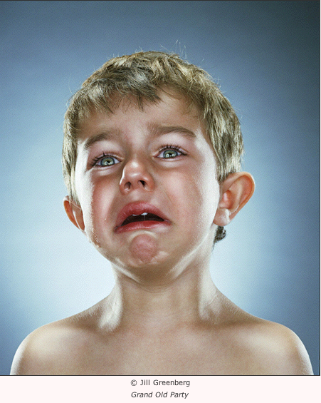
Jill Greenberg slagged off the bloggers. They apparently have too much time on their hands, because why else would anyone, looking at the photos in her latest exhibition, End Times, at the Paul Kopeikin Gallery on Wilshire Boulevard in Los Angeles, reach the conclusion that she was a monster who had abused the children who were her subjects?
Thomas Hawk thought she should be arrested and charged with child abuse. Jeremiah McNichols weighed in then from a visual arts perspective.
The curator, Paul Kopeikin, is complaining about the hate mail and Greenberg has made it all the way to BBC podcasts in what is, without any doubt, an advertising coup for her exhibition and her career as an artist. At last—she can now breathe a sigh of relief—she is famous, and her photographs are, if Kopeikin’s suggestions can be believed, walking out the door. And there won’t be any police enquiries into child abuse—not unless there are some facts we don’t yet know about, or perhaps the parents of the cry babies have some startling revelation about the unauthorised use of electrodes.
Greenberg pointed out in interviews broadcast by the BBC that babies cry all the time, at the drop of a hat, so to speak, and stop crying just as quickly. Babies cry, she told us, because lollypops have been taken away from them. In fact, that is how she got many of the babies in her photographs to blubber: she took their lollies away from them. When that didn’t work, and some other method was needed, the childrens’ parents were taken out of the room.
Before looking closely at these photographs—they claim to be art, after all, so we must look closely at them—there is one more thing I think it is important to note about this exhibition: Jill Greenberg has already told us what it means. I heard her talking about the meaning of the photographs before I had seen them. When she reminded me that children cry very easily, I felt sympathy for her position immediately. (She is being accused of child abuse, which is a serious thing to say about anyone.) A striking thing about the conversation, though, was the completely straightforward manner of telling us what the photographs mean.
Jill Greenberg wants to show us how upset these two and three year old children would be if they “realised the world they would inherit” (BBC Radio Newspod 27/7/2006). She feels upset, herself, about the environmental policies of George Bush, and is ‘depicting’ this distress through pictures of children that are upset. Greenberg has two children herself, a one year old and a three year old, so, naturally, she’s been thinking about these issues. The photographs were taken with the permission and co-operation of the children’s’ mothers; so there seems to be no question that, if Jill Greenberg was abusing these children, we are bound to hear about it from someone closer to the crime than the bloggers who want to put Greenberg away. Greenberg takes several swipes at the bloggers, saying of them that they obviously have too much time on their hands, that they hide behind a screen of anonymity, and have been careless with her reputation while putting nothing of their own at risk. (Or words to that effect.)
The question of the treatment of the subjects during the photographic session threatens to derail the stated artistic objective of the pictures, possibly because the stated artistic objective of the photographs is weak. It really is striking and ironic that in an age of very sophisticated understanding of art theory it should seem acceptable that a photographer-artist tells us what her photographs mean. Possibly it is just because we do not have direct access to the intentions of artists that they must now tell us what they mean. It is even stranger, really, that having heard what the photographer tells me the photographs mean, I don’t believe her—and, actually, I think, the meaning of the pictures is, at least as stated, more than a little bit silly. Greenberg cuts the legs from under the theorem she posits about her own pictures by immediately attempting to demystify the childrens’ apparent agonies. Children will cry about anything, and can cry almost all the time, so we shouldn’t be worried. Greenberg took their lollies away from them and, if that didn’t work, she took their mothers away from them.
In truth, we are being asked to suspend our disbelief for a little while, and consider what a child might do, how a child might behave, if it had an understanding of what its parent’s generation was doing to the world in which it had to live. Very specifically, the meaning of the photographs is a kind of joke: this is how we should react, Jill Greenberg seems to be saying to us, when we hear that the American military apparatus is torturing prisoners in Guantanamo Bay; and the appearance of the crying child in the photograph entitled ‘Torture’ is merely the weak, almost irrelevant, punch-line of the joke. We look at the poor girl’s face, the corner of her mouth falling off her face, and read the title—’Torture’ or whatever is underneath the next photograph on the wall—the same lame joke repeating itself over and over again.
It’s very strange, then, to be confronted with both a claim about the photographs in End Times and an obvious truth about the same photographs that are completely incompatible.
The children in End Times are presented to us in much the same way as the apes of Greenberg’s previous exhibition. Each child seems to be positioned carefully in front of a bluish, neutral screen, lit so that it is whiter at the centre. The children are lit like commercial objects, their skin and hair displaying a tremendously effective sheen, as though they’ve really been polished up for presentation to the camera. Some of the children have great rivers of tears flowing down their cheeks. Some look a bit dry. They are all, of course, without their lollies or mothers, a bit emotional; and Greenberg appears to have done a good job capturing the great variety of expressions that have enabled her to label the photographs so creatively. I can’t say that I laughed out loud when I read the titles, so perhaps the titles are meant to be amusing in the ‘Oh, that is deep, yes, how could anyone disagree with those sentiments’ sense, rather than the ‘O, God, please make it stop—I’m laughing so much it hurts’ sense. Greenberg has managed to keep the children positioned for the camera with great effectiveness, just as she did with the apes. Perhaps there is a technique she hasn’t let on? Were they (the kiddies or the apes) restrained in some way?
Most importantly, the sympathetic impulse one feels when seeing these pictures is qualitatively no different to the impulse one feels when seeing any child cry. There is nothing in the photographs about the state of the planet’s ecology, about the betrayal of public trust. Nothing whatsoever. There is just the title, hanging limply off the bottom of the image.
The children in End Times do not look like they are contemplating a terrifying legacy or some ineluctable, depressing future. Actually, they look like young children who have been bitch-slapped by a photographer. They look like exactly what they are.
Just in case you haven’t caught my drift, here is a truly disturbing photograph, taken in 1990 by James Nachtwey, of a child confined to a filthy cot in a Romanian orphanage for ‘incurables’:
Child in a Romanian orphanage, photograph by James Nachtwey (1990).
What art there is in this picture has been put to the service of underlining the horror of its subject’s predicament.
Looking at a picture of this kind, we do not sense that there is any trail of evidence leading from the child’s cry to the photographer. The photographer is irrelevant. Instead, we immediately find ourselves standing in the place of the camera, while very basic impulses rush to the front of our minds.
Seems like a simple question, doesn’t it. A gallery is for showing pictures, of course. Let’s be liberal, and say it is a place for displaying works of art, or where people go to view works of art.
I’m not referring to museums of art, or state galleries. The question is really about commercial galleries. The visual artists I know appear to be, now, in a situation something like the position poets were in twenty-five years ago (not much has changed, everything has changed) when there were, in Australia, literally no major commercial publishers of poetry and a few writers I knew got together and formed a small, private press to publish each other. Over the course of the following fifteen years this small unincorporated association published twenty books and had some success. By the end of it, though, it was still publishing slim volumes—we believed in quality—to deafening silence from reviewers. One of its last books was an anthology of more than a dozen writers that did not get a single review. When we asked the editor of a nationally distributed review magazine why no article was arranged, we were told the anthology was “obviously good”. Well, thank you, we said, and the conversation ended there.
Perhaps we failed to be interesting or controversial enough. Self-reliance is not newsworthy.
Visual artists could hardly claim to be in same situation. There are galleries galore. The public listings are full of openings to attend. Opportunities are everywhere. Or, are they?
It’s not as though writers or poets can claim there is no publishing going on. What we can claim, I think, is that publishers are interested only, exclusively, in their bottom lines, in seeing their accounts written in black ink. You can’t blame them. There is no profit in poetry. And there is no profit in some difficult visual artist whose work cannot quickly establish a market value that buyers are willing to match with dollars. It does not matter if he or she is a genius. Genius doesn’t pay the bills.
The principal difference between writers and visual artists from a commodity point of view is that writers create a product that is the art world’s version of fast moving consumer goods. Buyers literally take literature off the shelves, in shops that resemble supermarkets. Decisions are made pronto! A book is a standard gift option. Visual artists don’t normally make products of this kind. Purchases are considered. The visual arts are not bought to be consumed, and set aside, in the same way books are bought and shelved. This demeans the relationship readers have with literature, but there is a kernel of truth in it.
Commercial galleries plot a course between what one must suppose is a genuine interest in art and the mundane worries of their pockets. Welcome to the world as we know it.
There is nowhere for visual artists to go that is not smell of commercial relationships. Writers, by contrast, are the piece-workers of the art world, huddled in their garrets, earning a pittance for every thousand words: the smell of money rarely reaches their rooms.
Above all else, it’s disatisfaction that they share; and isolation from the very people who want to make contact with them.
Commercial galleries, if the system that the galleries describe were to work as perfectly as everyone hopes, offer more than representation. There is supposed to be much else that comes with the relationship: the problem is, really, whether or not this “much else” actually materialises.
Commercial galleries are supposed to:
Represent artists—that is, speak for them, and about them; negotiate for them; promote them.
Provide exhibitions or shows at least every two years.
Maintain up to date records of works held on consignment and try to sell these works.
Help to build an artist’s reputation by promoting scholarly and other writing about their art.
Generally, manage the relationship between the artist and the market to maximise the artist’s opportunities to profit from his or her work.
If galleries actually achieved this for more than a handful of the most prominent visual artists, artists would think, no doubt, that the galleries were doing a good job.
But they are not doing it.
A mid-range artist in Australia, for example, exhibiting 30 works at a significant commercial gallery once every two years, and selling perhaps 20 of these (a successful show!) for an average price of AU$4,000, brings $80,000 to the cash register. Forty per cent of this goes to the gallery: $32,000. This leaves $48,000 for the artist. A pittance for two year’s work. It’s no wonder they have to have second jobs! (Let’s not even mention the tax situation.)
No-one attacks the galleries. Why would anyone want to? Even if there were any public discussion of commercial galleries, surely artists would not have anything bad to say about the galleries that are, of course, the very arteries through which the life-blood af art courses…
Absence of discussion and debate does not mean absence of comment. It is well-known, of course, who the bad apples are. (Who knows, we might even get around to naming them here in future episodes: stay tuned…)
It’s the relationship between artists and galleries I’m interested in. Now, do you notice anything odd about the following statements quoted, verbatim, from the ACGA website:
Vision:
The Australian Commercial Galleries Association seeks to contribute to the visual arts in a way that enhances understanding of and support for the primary market while cultivating sound entrepreneurial ethics and an ever-strengthening national and international market for Australian art.
Mission:
The Australian Commercial Galleries Association exists to represent, promote and further the interests of Australian commercial galleries whose core business is the ethical representation of living Australian artists. A dual aspect of the Association’s mission is to develop Australian artists’ livelihood and reputation while contributing to an enhanced public understanding of contemporary Australian art in the primary market.
ACGA
I think there are several strange things going on in these quotes, not least of which is that the vision statement does not envision anything (unless it is that the national and international market for Australian art is “ever-strengthening”). I wonder, for example, why this organisation is so obsessed with ethics and ethical bahavior. Has someone accused it or its members of something terrible, or do their consciences need to be salved?
I mention this obsession with ethics in the vision and mission statements of the ACGA because the point at which the code discusses a gallery’s right to receive a commission on all sales of an artist’s work strikes me as being distinctly unethical.
The partnership between the gallery and the artist establishes commission as payment by the artist for the gallery’s intensive ongoing work and representation in the development of the artist’s career, reputation and livelihood. As such it should be recognised as an agent’s fee, earned by the gallery in return for the type of ongoing services listed under item 4.
ACGA
Item 4 in the code of practice lists a whole heap of things that galleries barely do at all for most artists, and do very badly most of the time. (Read the whole sad catalogue at the ACGA website.) The code is, in fact, a strained attempt to justify a claim that artists, particularly struggling, unknown artists, but also middle-rung artists, have little or no power to deny to galleries.
Artists, in fact, have to put up and shut up in the face of galleries who do nothing for them between annual or bi-annual shows but still want 40 per cent of sales they haven’t been involved in.
Wouldn’t it be fairer, more ethical, as a starting point in negotiations between artists and galleries, to say that galleries were entitled to up to 40 per cent commission on any artworks they choose to show, or choose to hold on to between shows?
You can hear the director-fussbudgets of galleries around Australia huffing, puffing and moaning already, can’t you? Oh, dear, how will they ever earn a living if they only get commission on the works they really want to sell?
The services these fussbudgets (don’t go off to the dictionary: it means one who is overly particular about unimportant things) offer to artists are described in terms that make their gallery businesses sound like retirement homes for librarians. They promise to be monitoring, archiving, maintaining and pursuing. And when they’re not doing that, they’re cultivating, collaborating and recording. All very important stuff, I don’t doubt. Meanwhile, it is the artist who is doing the real work.
The list of services that galleries perform to earn their commission is a furphy, a wild rumor, a tall story, and everyone knows it. Artists make their reputations by sticking at their work. It is a hard slog that, even for artists of acknowledged brilliance, goes on for years. To pretend this isn’t the case, and instead put about that the development of an artist’s reputation and career is something that is strategised by whispers and nods between gallery directors and clients with too much money in their pockets, is simply to lie. And there’s nothing ethical about that.
What is going to change, though? How can the system be changed? Important questions, to be answered by someone else.
Riccardo Angelo’s art seems very accessible when he paints identifiable figures and poses, but inaccessible when his private thoughts and knack for surrealism take over the imagery. The theory, popular amongst critics of literature, that ‘the author is dead’ means that we do not have access to the intentions of artists. It is an idea that attempts to dislodge artists from the centre of their own work. It may be an effect of that dislodgement that art dealers—auction houses and galleries—encourage us to think of artists as in or out of fashion and, themselves, engaged in a struggle to stand for a while at the head of an advance guard. It is to everyone’s advantage that some artists appear to be at the cutting edge of taste, where investments will show a good return, and it is also completely irrelevant to the artwork.
Art criticism has a long list of well-worn words that are useful support critical claims to seriousness, and often before such claims to seriousness are warranted. Artists learn at art school and sometimes remain in the habit of obscuring what they know with what they learned.
It is a curious thing that the art world, the public language of visual artists, is saturated with artistic “intentions”. “What I mean by this is…” “In this picture I was trying to achieve…” “This is a painting about…” “So-and-so is trying to…” We lap up the intentions of painters in a way that we would find intolerable with, say, novelists.
However, I can not reconcile this effect with the knowledge that no artist I know talks to me about their art that way. (This, I have to admit, may simply show how I made the world I live in!) The more closely I get to know an artist, the less the conversation is about the apparent content and motive of the work than about the struggle to make it—about techniques, methods, materials, errors, frustrations and experiments.
This all amounts to saying that the artist’s history of art is very different to the art critic’s history of art. This is a fact worth noting. To an artist, the history of art is principally the history of the mastery of techniques and the struggle with materials: what is passed on, what is forgotten, what remembered, what can be seen or inferred from the surface of a painting and what must be imagined, what is discovered and what has to be re-invented, what he can do and what he cannot do. No-one who has spent any time with artists, listened to their conversations, and shared their practical daily concerns about their work, could deny that this is a basic truth about being an artist.
In this context, I think that Riccardo Angelo’s Nineteen monotypes exhibition was a litmus test of how to look at art, since its subject was not only the familiar figures that filled up the white space of the paper the monotypes are printed on, but also the technique itself. The nineteen monotypes were made specifically to draw attention to how they were made, and to the fact that the process of making them involved various, sometimes unexpected, stages of work.
The monotypes
Monotypes, as the name implies, should be one of a kind. Ink is applied to a plate that can be made of metal or glass, and may be flexible or rigid. The ink may be drawn on the plate; or painted on; or painted on, then rubbed and scratched off to make negative details. Plate and paper come together, sometimes, though not necessarily, in a press (a burnishing tool will suffice for some variations of the technique). The paper is peeled off the plate to reveal the image. The plate is wiped clean and the process starts again. Degas was a master maker of monotypes and he invented several distinctive variations of the technique, including making further images off the already used plate and hand-coloring the fainter second impressions. The beautifully luminous dancers’ tutus in Degas’ monotypes were made by first rubbing solid black ink on the plate and then rubbing away the ink with brushes and cloths to leave a blank area in the form of a white dress.
Riccardo Angelo’s nineteen monotypes were exhibited at a small, fine art gallery in Melbourne in September 2005. Angelo has made hundreds of these monotypes, usually in groups of about six to twenty. They are all organised by date. They do not have titles. The titles of the nineteen monotypes, taken randomly from superficially appropriate passages of the book of Genesis, were added to the monotypes at the request of the gallery director. The dates tell the viewer that some of the nineteen monotypes were made months before many of the others. Most, according to the dates, were made on a few days around the middle of December 2004.
First impressions: the meaning of ‘monotypes’
A monotype is one of a kind. However, the technique of making them encourages an artist to experiment with how the ink is applied and removed, repeating patterns, shapes and content in evolving sequences. Almost all monotypes are an instance of an evolving process and, of course, sometimes, failed prints are thrown away.
Many of the pictorial elements of the whole exhibition are in these first monotypes, made in August 2004. Birds. Wings. A squatting child. A snake. Two figures kissing. A figure kneeling, legs forming the shape of an inverted ‘V’.
In exhibition, the prints are not presented in any particular order. The first impression is confusing. Few viewers appear to spend more than seconds in front of each of the prints. You may look at the details of any print and become lost it its suggestiveness—the ‘drawing’ that forms the basis of the prints is apparently wild, undisciplined, free. Indeed, it is hard to imagine how it would be possible to control the materials to produce a fine effect: the viscous ink, brushes and glass are not ideal instruments with which to draw. Angelo is an excellent draftsman, but his abilities don’t appear, at first viewing, to be on show here.
It is only when viewing the prints from a distance and as a group that revealing patterns begin to appear.
Techniques and variations
Why do many of the monotypes present us with a figure that has fallen to its knees to form an inverted ‘V’ shape with its legs? Man, woman, dog, and creature—they are all the same—all reduced to the same pitiful position. The supplicant, bowed shapes of all living creatures in this world, Angelo seems to be saying, should tell us about something they all share. It is hard to pin down what he might be referring to. Most of the monotypes have some explicitly sexual content, but they are definitely not erotic. It is not even, really, a human theme. In the world of these drawings, man and dog suffer in the same way, men and women are equally exposed, and all nature becomes part of the muddled, expressive, psychological moment of the work and of the exhibition.
Then there are the groups of two or three monotypes that belie the individuality of the print process. It is clear from these prints that Angelo does not always clean the glass plate he uses before beginning work on the next impression. He reworks an image he has already made by making new layers of ink stick to the half-dried layers underneath, and he adds new details.
The monotype process produces unique prints, but Angelo has rediscovered something that Degas knew: the plate, whether flexible metal or inflexible glass (other materials can be used), becomes an anchor that keeps the work on theme. The plate remembers the structure and some of the details of the drawing, and always provides a useful departure point for the next drawing, if one is needed. The process itself is also telling us that the work is not random; not as random as we first thought.
These three prints demonstrate something different. Between one print and another the details may change dramatically, but the underlying structure of the picture can remain the same. On the right hand side of the three prints there is a group of trees, or a tree. On the left hand side: a much larger tree, a female figure (perhaps like a sphinx), and a child’s face with its mouth open, crying. Of course, there are birds, beaks, animals and snakes everywhere, making it difficult to see these figures. Look at the prints for a while and you begin to realise that deep patterns have repeated themselves.
The next two prints reveal another variation in the technique.
The second print is a reverse print of the first. This means that the second print must somehow have been printed from the first print, or the image reversed on the plate and re-printed.
What does it all mean?
One of the reasons I wanted to write about this exhibition, and why I wanted to publish a permanent record in print of these nineteen monotypes, is that it allows me to discuss an unresolved question about the relationship between artists and their critics. I include in ‘artists’ all kinds of artists, though I realise that, increasingly, it is used to refer only to visual artists.
So much of what one reads about art is shallow, ideological or self-serving. Is there an appropriate way to write about art at all? I’m not really sure. I would align myself with Susan Sontag, if anyone. I am not interested in producing another interpretation, but in what I see and in transmitting some of that excitement about what is visible.
This is, itself, a philosophical manoeuvre, of course. An ‘interpretation’ cannot avoid being, at some level, an attempt to master and comprehensively remake the art it is talking about. Interpretations come to stand for the works of art themselves. There is nothing intrinsically wrong about that. In fact, in life as in art, an interpreter is exactly what we need sometimes.
However, it is undeniable, I think, that certain critical ‘positions’ or theories seek to remove artists from a privileged relationship to their own work. The effect is strange. The public discussion of art is carried on as though art itself were an ‘effect’ or by-product of the history of ideas. Artists are made to line up while an -ism is pinned to their lapels. At some point the unreality of it may strike you as itself meaningful.
Riccardo Angelo’s Nineteen monotypes exhibition invited us to view ourselves in the act of looking, and to notice how many of the artist’s intentions and meanings could be traced from one moment to the next.
Drawing falls and folds of cloth has been a standard exercise for student artists in their teachers’ studios. Along with perspective, chiaroscuro, flesh, and hundreds more particular painterly ‘rules’, mastering this painting exercise is a foundation of depicting human reality. Without it, it would be impossible to present any image of a man or woman in his or her social reality. It is not only the depiction of our clothing that the painter has to master—the space in which it appears, the volume it contains, the sources of light playing on its infinitely varied surfaces. There are also beds, furniture, curtains, and all the rest.
Shane Jones was apprenticed to the depiction of reality in paintings for twenty years before his own peculiar ‘take’ on realism began to emerge in his work. Virtually all the early paintings—still lives, street scenes, rooms and objects—have been destroyed. It is strange, now, that everything he has learned about painting is pressed to the task of depicting a reality that none of us has ever seen: a realism that looks like pure psychology.
A man dressed in a gray suit and a woman in a long, deep red dress stand with their backs to us. Behind them is a white curtain which reaches from somewhere out of the top of the painting to the surface the figures are standing on. There are actually two curtains: one for each of the figures. We can see, in the middle of the painting, that the two falls of curtain meet and overlap—except at the very bottom, where a small, triangular, black space, tells us that there is nothing or something on the other side of the space in which the figures stand. If you knew the artist, you would immediately recognize the male figure as the artist himself. However, for the purpose of the picture, it is just a man. There is nothing very special about him at all. We cannot see his face. We do not know whether he is anxious or calm, handsome or ugly. His companion, the woman in the red dress, may not be his companion at all: the two figures have adopted the same pose before us, turned away from our gaze, but they are not standing together. Well, they are not necessarily standing together. She has no feet. The dress is just long enough—just the right length—for the feet to be hidden. She seems to hover on the stage. Is it a stage? If it is a stage, are we also part of the performance that is about to begin, or that has just ended? Should we feel relieved and happy that the drama is over, or apprehensive because it just about to begin? The curtain may not be the curtain of a stage at all—perhaps it is only a curtain, a white sheet hanging in a gallery, much like the room in which the picture itself is hanging.
For the past four years Shane Jones has been methodically emptying his paintings of unnecessary clutter. In 1996 he won the Norma Bull Prize for a self-portrait. He emptied the room in which he painted himself by lowering the point from which the viewer seems to look on him: only the ceiling and an empty wall are visible in the background.
In 1997 Shane Jones saw the paintings of Avigdor Arikha (1929-), in particular ‘Slippers and Undershirt’ [1979]. The discarded clothing in these paintings, arranged like abstractions, seem heavily laden with their absent human bodies and activities. Shane Jones began to paint articles of clothing and falls of cloth. But these paintings are not copies of the effects Arikha achieved, any more than Arikha’s ‘Self-Portrait in a Raincoat, Peering’ (1988) is a copy of Joshua Reynolds‘ ‘Self-Portrait’ (c. 1748-9). Jones emptied his paintings of any discernable background and, as well, of perspective: handkerchiefs and cloths were unfolded and flattened to reveal their commonplace designs. These objects, sometimes painted at ten or twenty times their natural size, sometimes at ‘actual size’, were presented as though emptied of their function. No longer useful or used objects, they became simply something to look at: reality magnified. Articles of clothing, male and female, were presented to us neatly, often actually on their hangers, but floating in black space. Dresses, shirts and jumpers are the ghosts of their owners.
Deborah Klein and Shane Jones.
An untitled painting of 1998 went so far as to show only what appeared to be a white sheet suspended in black space, the upper left-hand corner hinting at something that could not be seen—a hook or nail holding everything up. We are forced to acknowledge our first ideas are often wrong when we notice the white sheet is, in fact, full of color—pinks, mauves and greens.
Underneath the thin veils that now hide his subjects’ faces, Jones has painted a real portrait of himself, a model or a mannequin. There is a Japanese flavor in the spatial arrangements and blank interiors that owe much to James McNeill Whistler.
Asked about the meaning of his paintings, Jones sometimes quotes Benjamin Disraeli: “To be conscious that you are ignorant is a great step to knowledge.” Or, at other times, he will say: “When I was twenty I thought I knew everything; at forty I thought I didn’t know anything at all…” This is really Jones’s subject: the feeling that we do not know very much about other people or about ourselves: uncertainty and ignorance painted with pared-down, formalised and quasi-realistic effect: the suspicion that commonplace certainties might some day turn out to be doubtful knowledge.
“It’s about plastic surgery,” Walter van Beirendonck told me. I knew it wasn’t about fashion, or clothes, which is what I had a right to expect it would be about. After all, Van Beirendonck is a fashion designer, and he had just spent an hour or so with an enthusiastic young crowd at the RMIT Storey Hall auditorium, saying several times during the discussion on stage that he was not an artist.
To be an artist, if you are a fashion designer, I began to think, must be something like being branded impractical or noncommercial or incapable of designing wearable clothing.
Van Beirendonck’s recent designs, clothes that are much less commercial than the street wear and jeans for which he became well-known, can still be bought from his shop in Antwerp. Just the place to go if you want an haute couture, plastic, cherry-colored suit—available in all sizes.
Spring 2012 collection
The problem is that van Beirendonck is an artist, or is behaving like one. At a Paris show a few years ago he put his models on stilts (the kind that plasterers use to reach ceilings), covered their faces, turned on the spooky music and waited for a reaction. The resulting ‘performance’—it’s difficult to continue calling it a ‘fashion parade’ or anything else that implies display of goods—was tremendously affecting, presenting the audience with the unexpected vision of models who had distorted their bodies to achieve a sort of perfection and had, at the same time, erased their identities. It’s no wonder that van Beirendonck’s shows are popular.
Transplanted to a theatrical stage, cut loose from the delimiting response of an industry audience, some moments he devises could easily be mistaken for ones by Pina Bausch, the German dancer, choreographer and champion of modern dance.
These effects on the catwalk have not come easily or suddenly to van Beirendonck. It’s clear from the videos of him, when he began teaching fashion in Belgium in the mid-1980s, that he used to look and behave more like we imagine a fashion designer should.
These days, fortyish, he admits that a gradual change has overcome him, the result of a desire to be more himself. He’s gone through many changes, in fact.
Fashion is the commodification of change, n’est-ce-pas?
He used to say, “Fuck the past! (Kiss the future).” One of the audience at Storey Hall wanted to know why he hated history. He is adamant that he does not; it’s just that he does not want to be tied to it.
Now he says, “You are not alone.” In the last few seasons he has stripped his designs of all ornamentation and shown us a bland future; dressed his models in hokey cowboy street wear and made them boot-scoot; then presented them all in pale-colored, knitted, clingy frocks.
Walter van Beirendonck
In a way, it’s interesting: fashion as a vehicle for thought… Do you think it’s going to work? Van Beirendonck certainly gives it a go, but the problems are too obvious. One of his recent shows sported the title ‘Gender?’ It was not about gender at all. It wasn’t even about sex (which is what most people think ‘gender’ is). It was a display of androgynous models. There weren’t any women.
“It was a male collection!” van Beirendonck explains. Exactly. Why pretend to be thinking about gender at all?
The reason, I suppose, is that fashion is not about the clothes, and not about being an artist, and not about thinking, or performance, or even business and money. It’s about expressing yourself. So there.


You must be logged in to post a comment.