Why, when the singing was over, did the young man’s nose look crooked?
Normally, a choir will line up to fill the space in which it sings, but this choir is a circle.
When the game is over and the teams fall back to their rooms, the losing side sits dejectedly along the walls.
The winning side stands in a circle of players, to the exclusion of all others, arms around each other’s shoulders, singing the club song. The words tumble out quickly. There is no effort at all to co-ordinate one voice with another, and no division between tenors, baritones, and basses. And, certainly, no harmony. Heads and shoulders bob up and down excitedly in the rhythm of the song.
Why, when the singing was over, the winning club and fans all happy, was the young man’s nose crooked and his face covered in blood? He was singing with the others. He sang the same lyrics. Players noticed the rover’s grin through a face covered in mud and sweat.
But, just as the singing stopped, and a cheer went up, everyone in the room shouting exaltedly, the smallest man there stepped back from the circle and his face turned away, body bent double, hands cupped underneath his nose as a stream of sticky, vivid red blood poured over his mouth and jaw.
The room was still murmuring with self-congratulation and laughter as arms began to gather around the rover’s shoulders to help him to a bench. While players and team staff fussed around the rover’s head, offering towels, simultaneously barking questions and commands— “What happened?!” and “Put your head back!” —all eyes turned to the bloodied centre of the room.
“No. No. Please don’t. I’ll be all right,” the rover said, adding a hint of uncertainty and pathos with “… I think.” A doctor was called. And the doctor called an ambulance. “I’ll be fine. I think.”
It did seem strange that a nose so irregular should take so long to bleed after coming off the field. Absent testimony or witnesses, the coach and some players scoured video of the game for any record of the final moments of play and of the opposing team’s crestfallen retreat from the field. They found nothing, and their rover was silent, except to apologise for the trouble his nose had caused.
Some secrets escape even a camera’s gaze, and the next day, when club managers viewed a CCTV recording of the circle of men singing, it was still not clear what it showed, or that it showed anything. Arms raised and bodies jumping and hugging obscured the final second when the rover stepped back from the choir. In one moment he stands next to the team’s ruck, the taller player looking down into the rover’s face; and in the next they have both disappeared in the chaos of the team’s rejoicing.
When, the next day, the rover’s face emerged with a bandage on it, a theory also surfaced. And, since rumors abhor a silence, there were many more fictions than facts about what had happened. Neither the plentiful fictions nor the rare facts would go away; and both the rover and the ruck were silent.
The public’s mind is a dark and noisy place, and imagination lights a flame where there is no spark of intelligence—or truth. It was inevitable this imaginary fire would have to be put out, but the coach’s remarks to journalists seemed obtuse, like someone trying over and over to kick goals with a lettuce. The ruck was there, too, thinking he might have one chance to douse the hot mess.
One journalist squeezed her way through to the front of the conference. “Don’t mind me. I’m short. You won’t miss a thing,” she said, excusing herself, as she pointed a recorder up to the ruck’s mouth. “There’s been a suggestion,” she called out in a loud voice with staccato emphasis on her key words, “that you’re going to offer a ‘… gay … panic …’ defence and that …”
“Hold on. Let me stop you right there, so you don’t embarrass yourself. I don’t want anyone to be embarrassed. I … did … not … punch my friend in the nose because he touched me in a … special … way,” the tall man said, repeating the journalist’s staccato. “I punched him because he didn’t ask first.”
“Why, if Mr and Mrs Been-to-La-Boheme-six-times can have their seats subsidised without filling out a form in triplicate, are the processes for writers’ grants so damned complicated and exhausting?”
Toner-gate, Victoria’s little arts scandal, revealed some interesting facts about government and administration of the arts. Firstly, public sector employees working in the arts believe that going to arts events is “a fundamental obligation of their professional life”. Penny Hutchinson, Director of Arts Victoria, rejects the idea that free tickets to arts events should be registered as gifts. The Ombudsman concluded, “a lack of management and auditing at Arts Victoria contributed to a culture that allowed the corrupt conduct to go undetected”.
Secondly, the Director of Arts Victoria told the Ombudsman that department employees keep a diary of their attendance at arts events. However, neither the Arts Victoria website nor the Department of Premier and Cabinet (DPC) annual reports of Arts Victoria’s activities contain statistical information gathered from employees or arts organisations about the numbers of tickets given away, for this or any other purpose. Detailed statistical information about attendance at arts events comes mainly from Australian Bureau of Statistics data from census interviews. The Arts Victoria website is an analytical wasteland. Sure, you can find out how much money the government spent and on what projects. When percentages and dollar figures are provided, they all point to the munificence of the public purse and the crucial role of the arts in the economy. They are statistics served up like comfort food to make the public sleep.
Third, though Toner-gate is trivial compared to other public sector governance problems (annual expenditure on ICT in Victoria is around $1.6 billion), the numbers are not trivial to artists themselves—especially artists, like writers and poets, who are not part of the ‘color and movement’ industry. Chris Flynn, who organises writers’ events in Melbourne, posted on Facebook the day the Toner-gate news broke, “Thank God I didn’t get those Arts Victoria grants after all—turns out they needed 80 grand to buy toner.” I suspect this reaction would be mild among writers.
The ABC’s comedy series ‘Angry Boys’ was viewed by “just” 569,000 viewers on Wednesday 15 June 2001, when it went head-to-head with broadcast of a state of origin rugby union match. Chris Lilley, the comedic artist in question, must think that such contests are a harsh proving ground.
Go the Melbourne Symphony Orchestra (MSO) website and look at the 2010 annual report and you will find that in 2010 the total audience for 2010 was 181,387. The total “paid attendance” was just 121,330. It’s not clear from the report whether any of these figures includes free concerts in the park (40,000 in attendance) or other outreach programs. Using the two available numbers, 33 per cent of seats at concerts are given away.
The Victorian Opera annual report includes the tantalising remark that audience figures are prepared according the standard Arts Victoria methodology. Gosh. Arts Victoria has a methodology for counting audience numbers? —Its annual report does not say what it is. Neither does its website. And this is strange because performing arts publications make so many remarks about audience numbers, it would be handy to know if there is a ‘special’ way of counting them.
The VO says that the total audience in 2010 was 41,799. This number includes dress rehearsals, educational and promotional events, and even 6,500 at free concert in The Bowl with the MSO. Leave all free seats in, and any others that may or may not be free, and divide it into the total of government grants (including a small sum from the federal funding body), and it appears that every single seat at an opera event is subsidised to the tune of $91. This figure is closer to $150 if you exclude seats given away for whatever reason; but, because we don’t know how many seats are filled by arts administrators for the purposes of “professional obligation”, there is no way of telling how high the figure goes. To be fair, the numbers should look better if one took into account that public funds also pay for modest administration, marketing and other expenses.
None of this even touches on the extraordinarily generous donations received by the operatic arts by various kinds of patrons, though it is interesting to note that the VO annual report has two not-quite-full pages of these donors’ names, some of whom gave over $20,000 and at least one (I wonder who?) who came up with $2.
The Threepenny Opera was one of the first musical films. Weil and Brecht filed lawsuits against the production company over its handling of the script and music; and both collected damages. The film was screened for the first time in February 1931.
And the numbers were especially healthy in 2010 because of the spectacular success of Kurt Weil’s ‘Threepenny Opera.’ More than ten thousand people attended 22 performances, about two and half times more than the next most attended opera and about five times more than most.
Why is the writer beating up on the euterpean muse? (I didn’t even look at the statistics for the ballet. My pure heart would be too beaten up!)
Arts Victoria’s and DPC’s websites used to bulge with business plans and targets related to the ‘Creative Capacity +’ framework for arts development in Victoria, a document that, now, even Google can’t find in the Orwellian memory hole of documents published on the Internet.1 I used to look into them to wonder, as I do now after Toner-gate, how little light these numbers, goals and performance measures throw on the ironies of arts funding.
Why, if nearly a third of seats at some concerts are unpaid for, is there no detailed information about how the seats are filled?
Why, if public taxes pay for astonishingly expensive artistic productions, are these productions not televised?
Why, considering apparent waste and inefficiency, can no public funds be found to support a poetry recitation prize for Victorian secondary school students? And why, if Mr and Mrs Been-to-La-Boheme-six-times can have their seats subsidised without filling out a form in triplicate, are the processes for writers’ grants so damned complicated and exhausting?
Why, if arts administrators can have free tickets to attend arts events, can we not provide the same advantages to artists themselves? I could, within a week if asked, provide a list of several hundred creative writers whose artistic education would be enhanced by nights at the opera and in our concert halls and theatres, myself included.
Penny Hutchinson’s tortured responses to the Ombudsman’s report demonstrate, amongst many other things, that she has no imagination. Maybe that’s what it costs you when “professional obligation” takes you out for a night on the town.
The document can still be found in Pandora, the government repository of stale, public websites: Creative Capacity +. ↩
The general flavour of reporting about the failure of Konstantin Dimopoulos’s tree-painting project in Melbourne was sympathetic. The Herald Sun’s Andrew Bolt took at a swipe at the waste of public monies. Aside from that, it was Victorian politician Mary Delahunty who took most of the ‘blame’ dished out in public over the failed plan.
Dimopoulos came to Australia from New Zealand in 2004, and calls himself a “public artist”. This is the kind of heroic claim that should immediately make our ears prick up. I think, considering what is at stake, we might be entitled to a definition of what a “public artist” is. Most of Dimopoulos’s work in the past has been, in type and character, distinctly ordinary: paintings, sculptures, drawings, installations, and a few pieces that have been placed in spaces that, on the face of it, appear to be accessible to the ‘public’.
The language that Dimopoulos gathers around his project assures us that ‘Sacred Grove’ is no mere work of art: it is an “art action”. Other kinds of art—painting canvases, writing books, composing music, and so on—are the inactive arts: the arts that do nothing, do not get up out of their armchairs and go marching in the streets.
Dimopoulos leaves visitors to his web site in no doubt that painting trees blue is not just a magical aesthetic experience, but one that will help to prevent the de-afforestation of the planet. In this way, he wraps himself and the ‘Sacred Grove’ project in the pure intentions of Gaia. This is what the [2006] web site said:
Sacredgrove—the blue forest is a public art installation by conceptual artist Konstantin Dimopoulos. Sacredgrove is a global afforestation art action using art to highlight trees as sculptural forms, and the need to replenish the world’s trees.
When the Melbourne City Council finally rejected the ‘Sacred Grove’ project, and the State Government in Victoria was called on to justify the c. AU$100,000 it had given to Dimopoulos, it came to light that among the expenses for the project were amounts for promotional multimedia materials to be distributed to other cities around the globe. The purpose of these materials was to promote similar projects in other cities: sacred groves growing up all over the planet… Just imagine it! What a neat little money-spinner the success of ‘Sacred Grove’ in Melbourne would have been. As it turned out, a Melbourne hotel took pity on Mr Dimopoulos and allowed him to paint a small grove of trees it manages at the entrance to its Collins Street building. (Dimopoulos’s promotional materials, including a Wikipedia entry written by his publicity team, now refer to the ‘Sacred Grove’ episode as a “pilot”, no doubt in order to prepare anyone who sees photographs of it for how underwhelming it was, and to gloss over the fact that negative public opinion killed the actually proposed project before he got a chance to get away with the loot.)
Konstantin Dimopoulos, installation of blue trees at the Sofitel Hotel in Collins Street, Melbourne, 2005.
As a ‘public’ and ‘conceptual’ artist, Dimopoulos makes claims that, from an art historical point of view, make no sense. For example, Dimopoulos is quoted in the article, above, saying to a journalist (who cannot be blamed for not knowing what the next question should be):
Public art is about taking risks. It does cost money but it brings people together.
I think this must be disingenuous. It is simply incredible that someone who calls himself a ‘public artist’ would not know about Christo and Jeanne-Claude; or have the temerity to believe no one would or could make the just comparison between this kind of public art and the public art of Christo and Jeanne-Claude. There are obvious comparisons to be made, in both the approach to getting works approved and in the works themselves.
For anyone not familiar with the details, here are the basic facts, to help the comparison along…
Christo and Jeanne-Claude’s ‘Wrapped Reichstag’ project, to take a well-known example of their work, took 24 years to bring to fruition. During all this time, and after it was achieved, they did not accept a single cent, or a single pfennig, of payment from public funds. In fact, Christo and Jeanne-Claude never accept any public monies to complete their art works.
It is also instructive to note that the Christo and Jeane-Claude’s process for achieving their public art includes having to convince everyone, including the public and any interested parties, that the artwork should be permitted to proceed.
They are justifiably famous around the world for the rigour of their approach. Think what you like about the aesthetic experience of their art, no one I know of doubts the purity of their practice. They are beholden to no one.
The risk they take for their public art is their own misfortune.
Dimopoulos’s plan to make the people of Victoria pay for his project to re-aestheticise the world’s parks and avenues does not sound so heroic in this light, does it? His public art does not sound so risky.
Perhaps it would help if his project had the advantage of originality, but it cannot even claim that. Dimopoulos knows that the tradition of painting trees is a very old one in Greece. It survives today, to the surprise of many visitors, in the practical habit the Greeks have of painting roadside trees white where there is no road lighting.
Christo and Jeanne-Claude’s Wrapped Trees at Riehen in Switzerland in 1998.
Beyond that, Christo and Jeanne-Claude have beaten him to the tree game as well. (The photograph, above, is of Christo and Jeanne-Claude’s Wrapped Trees at Riehen in Switzerland in 1998.)
There is a striking similarity between these pictures and Dimopoulos’s “BLACK PHARAOHS APPROPRIATION 2005”.
Dimopoulos’s original description of the project ‘Black Pharaohs’ refers to the inspiration of his childhood, but does not mention he copied Christo and Jeanne-Claude.
The original 2006 website posting about Dimopoulos’s pharaohs refers to Greek mythology and the legend of Theseus (the pretentiousness of it is excruciating), but not a single reference to Christo and Jeanne-Claude. Then, sometime in 2006, images of the “BLACK PHARAOHS APPROPRIATION 2005” were removed from Dimopoulos’s website, only to reappear years later with a different description, written by Ken Scarlett.
The new description acknowledges the original work of Christo and Jeanne-Claude and says that the Dimopoulos variation is “interesting”—the kind of thing critics say with their chins balancing precariously on a curled index finger, à la Steve Jobs, while they try to force their eyebrows together to form a landing-platform for a new idea.
The suddenly proper acknowledgement of the debt to Christo and Jeanne-Claude still does not include any comment on the difference between Dimopoulos’s methodology and that of Christo and Jeanne-Claude.
Dimopoulos’s public relations team would be happy for you to think he works ‘in the tradition’ of Christo and Jeanne-Claude; not so happy for you to know his public art is an intellectual vacuum whose purpose is to suck up public funds.
In the years since Sacred Grove in Collins Street, Melbourne, ‘The Blue Trees’ project has become a whirlwind of public relations spinning. Though Dimopoulos has been happy so far to take $100,000 here, or $25,000 there, to paint trees in Melbourne, or Houston or Vancouver, or wherever local governments can divert funds from worthy projects to pay for his airfare, his ultimate aim is to paint the Amazon.
In the long PR journey that the Blue Trees is on, there is no mention in the world’s media so insignificant that it cannot be turned into an artistic aggrandisement. His 2013 website résumé proudly proclaims that the Blue Trees was named by TrendHunter as one of the top 100 activism trends of 2012. Indeed. Here is the reference from the TrendHunter site:
Trendhunter website screenshot.
With a score of 3.7 on the TrendHunter scale the Blue Trees project ranked below the trend of making sub sandwiches out of cucumbers, which scored 4.8.
Trendhunter website screenshot.
TrendHunter has estimated the worth of Dimopolous’s “art actions” perfectly. Here is a picture of the winning sandwich:
Photo of the 2012 ‘cucumber sub’ trend, which was a much more significant trend than Dimopoulos’s ‘blue trees’, according to the Trendhunter website.
Post script, 22 March 2015 — the Squamish affair
In the world of public relations even failures must be put to work boosting and spinning whatever it is ‘the company’ wants to foist on dazed consumers.
So it is with Mr Dimopoulos. In his latest pretence, on the unsuspecting citizens of Squamish, Vancouver, he uses images of his failed attempt to paint trees in Melbourne’s Yarra Park. The electronically altered image of Yarra Park appears on the Vancouver Biennale website, alongside images of other projects (which may or may not be altered, too, I don’t know).
Here is the image of the ‘proposed’ Yarra Park project, which never happened:
Image of the proposed Yarra Park project in Melbourne, reproduced in a Vancouver Biennale website where there is no comment on the fact it is not real. The blue trees in this picture are digitally altered to appear blue; they have not been painted.
Here is an actual (that is, unaltered) photograph of the blue trees project (aka ‘Sacred Grove’) in Melbourne, as it actually happened:
Entrance of the Sofitel Hotel in Melbourne, where the blue trees project ended up after a public scandal over the waste of public funds.
It does make me wonder if the good people at the Vancouver Biennale ever saw the real thing, or if they know they have published photographs of projects that have not happened?
Further reading
In the circle of men singing–Why, when the singing was over, did the young man’s nose look crooked? Normally, a choir will line up to fill the space in which it sings, but this choir is a circle. When the game is over and the teams fall back to their rooms, the losing side sits dejectedly along the walls. The […]
Not a threepenny opera–“Why, if Mr and Mrs Been-to-La-Boheme-six-times can have their seats subsidised without filling out a form in triplicate, are the processes for writers’ grants so damned complicated and exhausting?” Toner-gate, Victoria’s little arts scandal, revealed some interesting facts about government and administration of the arts. Firstly, public sector employees working in the arts believe that […]
The risk-free ‘art’ of Kon Dimopoulos–The general flavour of reporting about the failure of Konstantin Dimopoulos’s tree-painting project in Melbourne was sympathetic. The Herald Sun’s Andrew Bolt took at a swipe at the waste of public monies. Aside from that, it was Victorian politician Mary Delahunty who took most of the ‘blame’ dished out in public over the failed plan. […]
Cry babies and bloggers–Jill Greenberg slagged off the bloggers. They apparently have too much time on their hands, because why else would anyone, looking at the photos in her latest exhibition, End Times, at the Paul Kopeikin Gallery on Wilshire Boulevard in Los Angeles, reach the conclusion that she was a monster who had abused the children who […]
David Hensel | interview–I cheered on reading Brian Sewell’s scathing article about the Summer Exhibition, because I read it returning from going to the preview, where I’d hoped to find my own sculpture. Instead what I found was the empty base, without the sculpture. We know the art market prefers obscure art as somehow more advanced, and anything […]
L’Affaire Dimopoulos: ‘copy’ of ‘difficult’ N.Z. ‘artwork’ installed at Federation ‘Square’–Following the controversy, in 2005, about the Melbourne City Council’s sensible rejection of Kon Dimopoulos’s ‘Sacred Grove’ project, the Minister for the Yarts in Victoria, Mary Delahunty, announced that the AU$73,000 odd dollars ear-marked for the blue trees would be spent instead on a “site-specific” sculpture “similar in concept” to ones already installed at a […]
Ironising the ironisers: Edwards does Britney from behind–Daniel Edwards’ take on the pro-life debate is so outrageously perverse the pro-lifers are beside themselves, not knowing if they should be thankful or horrified. Edwards plants Britney Spears on all fours on a bear skin rug, arse in the air, the head of her baby crowning between her spread legs while her milk-laden breasts […]
Swinging pink flesh drives Indonesian Muslims wild–Here is the photograph, reproduced from the Sydney Morning Herald, that is causing all the fuss in Indonesia. It is, to be frank, neither very offensive nor very interesting. As usual, scale makes up for what imagination fails to provide…
Pathologies of outrage–Rhizome.org Rent-a-Negro Damali Ayo 25PEACES Tanja Ostojic The Rent-a-Negro website link flew around the internet a while back, many people linking to it as a humorous site. Initially few people recognised that the site was, as well as being very funny and beautifully written, a ‘serious’ art project. More recently, and more controversially, Tanja Ostojic’s […]
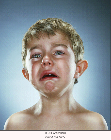
Jill Greenberg slagged off the bloggers. They apparently have too much time on their hands, because why else would anyone, looking at the photos in her latest exhibition, End Times, at the Paul Kopeikin Gallery on Wilshire Boulevard in Los Angeles, reach the conclusion that she was a monster who had abused the children who were her subjects?
Thomas Hawk thought she should be arrested and charged with child abuse. Jeremiah McNichols weighed in then from a visual arts perspective.
The curator, Paul Kopeikin, is complaining about the hate mail and Greenberg has made it all the way to BBC podcasts in what is, without any doubt, an advertising coup for her exhibition and her career as an artist. At last—she can now breathe a sigh of relief—she is famous, and her photographs are, if Kopeikin’s suggestions can be believed, walking out the door. And there won’t be any police enquiries into child abuse—not unless there are some facts we don’t yet know about, or perhaps the parents of the cry babies have some startling revelation about the unauthorised use of electrodes.
Greenberg pointed out in interviews broadcast by the BBC that babies cry all the time, at the drop of a hat, so to speak, and stop crying just as quickly. Babies cry, she told us, because lollypops have been taken away from them. In fact, that is how she got many of the babies in her photographs to blubber: she took their lollies away from them. When that didn’t work, and some other method was needed, the childrens’ parents were taken out of the room.
Before looking closely at these photographs—they claim to be art, after all, so we must look closely at them—there is one more thing I think it is important to note about this exhibition: Jill Greenberg has already told us what it means. I heard her talking about the meaning of the photographs before I had seen them. When she reminded me that children cry very easily, I felt sympathy for her position immediately. (She is being accused of child abuse, which is a serious thing to say about anyone.) A striking thing about the conversation, though, was the completely straightforward manner of telling us what the photographs mean.
Jill Greenberg wants to show us how upset these two and three year old children would be if they “realised the world they would inherit” (BBC Radio Newspod 27/7/2006). She feels upset, herself, about the environmental policies of George Bush, and is ‘depicting’ this distress through pictures of children that are upset. Greenberg has two children herself, a one year old and a three year old, so, naturally, she’s been thinking about these issues. The photographs were taken with the permission and co-operation of the children’s’ mothers; so there seems to be no question that, if Jill Greenberg was abusing these children, we are bound to hear about it from someone closer to the crime than the bloggers who want to put Greenberg away. Greenberg takes several swipes at the bloggers, saying of them that they obviously have too much time on their hands, that they hide behind a screen of anonymity, and have been careless with her reputation while putting nothing of their own at risk. (Or words to that effect.)
The question of the treatment of the subjects during the photographic session threatens to derail the stated artistic objective of the pictures, possibly because the stated artistic objective of the photographs is weak. It really is striking and ironic that in an age of very sophisticated understanding of art theory it should seem acceptable that a photographer-artist tells us what her photographs mean. Possibly it is just because we do not have direct access to the intentions of artists that they must now tell us what they mean. It is even stranger, really, that having heard what the photographer tells me the photographs mean, I don’t believe her—and, actually, I think, the meaning of the pictures is, at least as stated, more than a little bit silly. Greenberg cuts the legs from under the theorem she posits about her own pictures by immediately attempting to demystify the childrens’ apparent agonies. Children will cry about anything, and can cry almost all the time, so we shouldn’t be worried. Greenberg took their lollies away from them and, if that didn’t work, she took their mothers away from them.
In truth, we are being asked to suspend our disbelief for a little while, and consider what a child might do, how a child might behave, if it had an understanding of what its parent’s generation was doing to the world in which it had to live. Very specifically, the meaning of the photographs is a kind of joke: this is how we should react, Jill Greenberg seems to be saying to us, when we hear that the American military apparatus is torturing prisoners in Guantanamo Bay; and the appearance of the crying child in the photograph entitled ‘Torture’ is merely the weak, almost irrelevant, punch-line of the joke. We look at the poor girl’s face, the corner of her mouth falling off her face, and read the title—’Torture’ or whatever is underneath the next photograph on the wall—the same lame joke repeating itself over and over again.
It’s very strange, then, to be confronted with both a claim about the photographs in End Times and an obvious truth about the same photographs that are completely incompatible.
The children in End Times are presented to us in much the same way as the apes of Greenberg’s previous exhibition. Each child seems to be positioned carefully in front of a bluish, neutral screen, lit so that it is whiter at the centre. The children are lit like commercial objects, their skin and hair displaying a tremendously effective sheen, as though they’ve really been polished up for presentation to the camera. Some of the children have great rivers of tears flowing down their cheeks. Some look a bit dry. They are all, of course, without their lollies or mothers, a bit emotional; and Greenberg appears to have done a good job capturing the great variety of expressions that have enabled her to label the photographs so creatively. I can’t say that I laughed out loud when I read the titles, so perhaps the titles are meant to be amusing in the ‘Oh, that is deep, yes, how could anyone disagree with those sentiments’ sense, rather than the ‘O, God, please make it stop—I’m laughing so much it hurts’ sense. Greenberg has managed to keep the children positioned for the camera with great effectiveness, just as she did with the apes. Perhaps there is a technique she hasn’t let on? Were they (the kiddies or the apes) restrained in some way?
Most importantly, the sympathetic impulse one feels when seeing these pictures is qualitatively no different to the impulse one feels when seeing any child cry. There is nothing in the photographs about the state of the planet’s ecology, about the betrayal of public trust. Nothing whatsoever. There is just the title, hanging limply off the bottom of the image.
The children in End Times do not look like they are contemplating a terrifying legacy or some ineluctable, depressing future. Actually, they look like young children who have been bitch-slapped by a photographer. They look like exactly what they are.
Just in case you haven’t caught my drift, here is a truly disturbing photograph, taken in 1990 by James Nachtwey, of a child confined to a filthy cot in a Romanian orphanage for ‘incurables’:
Child in a Romanian orphanage, photograph by James Nachtwey (1990).
What art there is in this picture has been put to the service of underlining the horror of its subject’s predicament.
Looking at a picture of this kind, we do not sense that there is any trail of evidence leading from the child’s cry to the photographer. The photographer is irrelevant. Instead, we immediately find ourselves standing in the place of the camera, while very basic impulses rush to the front of our minds.
I cheered on reading Brian Sewell’s scathing article about the Summer Exhibition, because I read it returning from going to the preview, where I’d hoped to find my own sculpture. Instead what I found was the empty base, without the sculpture. We know the art market prefers obscure art as somehow more advanced, and anything can be aesthetic if presented well, but selecting an empty plinth seemed to typify the vacuity of a lot of the work in the exhibition.
David Hensel, an English jeweller and sculptor, submitted a sculpture of a laughing head on a plinth to the Summer Exhibition of the Royal Academy earlier this year. When he went to the exhibition, only the plinth and bolster were on display. After he released news of the mistake to the press, RA spokespersons asserted that the plinth had been accepted for display, because it had merit, and the head rejected. While the Academy turned error into insult, Hensel has been publicly pondering what the mistake really says about the state of art and art criticism. I contacted him by e-mail and the following interview goes over the facts of the RA story, as Hensel recalls them, and looks at Hensel’s work.
Williams: Let’s start by going over the facts of the Royal Academy (RA) incident. I have only read media reports on the internet. Sometime earlier this year you submitted a sculpture that consisted of a head, a plinth and a wooden bolster to the Royal Academy for its June 2006 Summer Exhibition. The RA has claimed, in the reports I read, that the plinth and bolster were submitted separately to the head. It’s not clear why that should be so. Were they in separate boxes? Was there one or two application forms? Did you receive an acceptance letter or acknowledgement of some kind? Eventually you went to see the exhibition and noticed that the plinth and bolster were exhibited without the head. What happened next? Did you speak to the curators? Was it you, or the RA, that notified the media of the circumstances about your sculpture? How did you, or they, do this? If it was the RA, did they show you the media release before sending it out?
Hensel: In May 2006 I delivered to the Royal Academy a single sculpture which, as you say, consisted of a head, a plinth and wooden bolster. The bolster was tied to a loop in the plinth, and the head was loose. They were delivered as one submission: the entry form gave three copies of the same self adhesive barcode, one of which was stuck on the bottom of the plinth, one on a provided tie-on label which went in a rather ungainly manner round the head, and the third went on the entry form. It isn’t true that they were submitted separately: this idea was apparently devised by the self-protection department of the RA and issued broadly in a press release a few days after the start of the furore. I wasn’t consulted or shown it, it just appeared in some of the press. Most of the papers I saw that carried it also mentioned my more honest version. I recently asked the exhibition co-ordinator about this point, but she didn’t respond.
I received an acceptance letter a few days before the show, after the whole selection process had taken place. This just said my sculpture, ‘One Day Closer to Paradise’, had been accepted for the show.
When I went to see the exhibition at the third preview (The first was the ‘Varnishing Day’, Monday. I would have gone then but I was teaching. It was pointed out to me that this is where they pick up glitches. The second was what they call the ‘Buyer’s preview’, Thursday. I went on Friday. The show opened to the public on the next Monday.) and noticed the error. I went to talk with the nearest staff member who was a girl at the desk. She said she remembered handling the sculpture herself for the selection (because it is heavy) and it was just the plinth at that time. She tried to contact the appropriate office but no one answered; so I left it that she would contact them the next day and they would contact me about it. It was Wednesday before they did contact me, by which time the papers had the story. The way this happened is this…
I had found myself dissatisfied with the show, and becoming more and more depressed as I went round. I hadn’t found my sculpture yet, but that wasn’t the issue. The work from the Academicians seemed far more repetitive, old and tired, than usual. An RA member is allowed to enter six without selection. Everyone else, anyone else, can submit up to three pieces to go through the selection process. No problem with that—just the tedium. I don’t know if you know the annual show—it’s huge: one thousand items selected from ten thousand. Usually—I try to go every year—it is inspiring in it’s variation and the quality of the real among the fake among the routine. Why was it different this year? I have to go again and find out (but perhaps I’ll wait until my name is no longer dirt). As I went on round, there seemed to be more and more work that may be innovative or would-be subversive. Towards the end there were a lot of items by the famous Britart brigade [Hensel is referring to Damien Hirst, Sarah Lucas, Tracey Emin, etc.], who it appears had been invited in to give the show a boost because the BBC were doing a three-part documentary and not because of artistic merit. I found my sculpture in the last room, on a pair of shelves like a store room. Or rather I didn’t find it. Only the plinth was there. OK, some people can discard a paper bag with such style that it’s almost art, and I agree that my plinth has some presence as an object, especially when viewed in light of the title. (I don’t know whether they saw the title but I’m assuming they did.) It is a monumental task mounting the show. I have huge respect for the organisers—the group of selectors—but there did seem to be rather a lot of dubious quality work there. And you should see the prize winners!
On the way home in the train home I read a terrifyingly scathing article by Brain Sewell. He is usually acerbic, but this time I found I agreed with too much. Something wrong at the Royal Academy, connected with their attempted pose as ‘up to date’. The usual way to sell difficult work is to put it in the white gallery. —But put it, instead, in a context of scholarship, traditional values of excellence, and it doesn’t make it easier to understand.
Anyway, Brian Sewell it turns out was a friend of my late brother in law. Too late.
I told a number of my friends about my missing sculpture. Most just held their heads, some gleeful at the ammunition potential against the fat heads who run the art world. The laughter matches so well the range of expressions of the missing sculpture, including the horror that it has from one angle. I decided to try to contact Sewell to see if he wanted to follow it up. Also I got, from a friend who knows him, the e-mail address of David Lee, who writes a magazine full of unusually well-observed criticism called The Jackdaw. I tried to contact Sewell by e-mail through the Evening Standard, the London paper which had his article. I was thinking about it a lot, somewhat aggrieved but also fascinated, wondering whether it could become a way to say something useful and air some of my views about it.
After the weekend I had heard from no one, but on Monday I was phoned by the Standard, which wondered if I would like to write letter to the paper, for publication on Tuesday. They hadn’t managed to get my request to Sewell or he hadn’t replied. He had been ill. He is 70 or more. So I did, and sent it in the evening. On Tuesday they phoned me again saying they would like to carry the story, as it was, in Sewell’s absence. —Which they did, on Wednesday. The rest is history, as they say.
Williams: Is the sculpture now on display, in part or reunited with its head?
Hensel: The RA did phone me after the Standard’s story, apologies and all that, but they had to ask the selecting artists for their opinion before they could do anything, again relying on experts, and on Friday they still hadn’t been able to get them in to decide, so they started insisting the plinth had been selected on it’s own.
By that time I had seen that there would be more in this by keeping it empty, though I would be willing to reunite them if they insisted. Eventually they said both parts had been viewed separately and the head rejected. I imagine the head wouldn’t come across without a base to stand on, but I know these artists by their work which is very different from mine. Inevitably when selecting from thousands, snap decisions based on taste are made, and if it has presence it can get in. Just because it has presence doesn’t mean it is art: that needs to have something more. Though, I do think it works well in this empty version—and I wish I had thought of it myself! Would have saved a bit of work. An afternoon instead of two months, more if you count learning the new medium I wanted to use.
At no time did I get angry or upset about it because already the words were available to describe the event as an example of cultural theatre in which we in the arts are all actors playing roles self-scripted, inherited from personal background or determined by personal awareness of context and audience and education. If education systems have flaws, they show up in styles of art: thus they are roles which describe the real world through the safety-net of the arts; and I feel this idea is one that can reunite us and save face all round. It’s a difficult concept for some it seems, but we’ll see. (An actor doesn’t need to get upset or embarrassed if his character is unable, slips up, or proves to be unaware.)
Now it is going to remain separate, just the plinth on show, and that suits the next development, which is that The Times is going to auction it as it is, accompanied by a documentation of the event so that it can be seen as a new work of art about the failed one.
Williams: In general, what would you say the public reaction has been to the news of what has happened to you, as distinct, say, from the reaction of the media and the RA?
Hensel: Most people I know have responded with laughter, by clutching their brow in disbelief, or been excited at the potential of the attention. I haven’t met many who are on the side of the contemporary art world, who are generally seen as somewhat fraudulent or stupid opportunists. There’s a recognition that, for dealers, the avant garde is a form of currency that is easy to forge. Of course, there are good artists, but there is a broad recognition that you don’t get fame and fortune by being good or relevant: there are other, esoteric criteria…
A fair proportion of the people I know are artists in one way or another, and they all seem to be delighted, as though it’s a justified come-uppance. There’s a generally held sense that these people deserve it—not the RA really, they’re respected, but the charlatans. Many artists play to the market, but that’s only healthy greed. The cheering is nothing to do with the handling error that caused it, obviously. We all feel the embarrassment they undoubtedly feel.
Williams: Had you ever submitted a sculpture to the RA Summer Exhibition before? I notice there is a piece on your website on a page referring to a previous Summer Exhibition, but it’s not clear whether that sculpture was accepted. It looks like an auto-fellating cherub.
Hensel: Exactly right, that’s what it is. It was accepted for the 2003 exhibition. It was the first time I had submitted anything, so that was pleasing. I couldn’t find that when I went either, but it was there, just high up on a bracket on the wall, presumably out of respect for the old ladies. The title I gave it had reached the stage of ‘The Old Bush Award’, and I saw it as a design for a trophy which would be given annually some time in the future in the name of G.W. [Bush] to worthy world leaders. I had first called it ‘Jerusalem’, after Blake, honoring his wonderful song against the British Empire’s use of Christianity—hence the religious aspect. The foundry called it ‘Angel’s delight’. Later, I changed the title to ‘Fountain’ thinking of Duchamp’s urinal.
Williams: I’d like to know how you describe our own work. You’re a jewellery maker and sculptor, making both indoor and outdoor pieces. Your jewellery appears to be more in the nature of ‘personal sculpture’: many of the pieces are very—how to put it?—visible. They would be hard to miss if someone were wearing them.
Hensel: I once many years ago recognised I couldn’t happily call myself an artist because I didn’t know what art was, so I decided to try to come up with a new definition every day. It’s a useful discipline—keeps the intellect out of the creative process when working. I still don’t know, though, but recognise that the desire to categorise and label is what all artists are trying to subvert, to find ways to get under someone’s skin. So, yes, my jewellery is personal sculpture. I always liked whittling as a child, but that doesn’t make traditional ‘sculpture’ because decisions are made hand-held, not placed on a plinth where they can penetrate the ground and permeate by impersonation into the viewer.
An inspiration in small sculpture was the way I like to find scraps of stuff that had presence, that looked as if they were something monumental, something huge and far away, or I was a giant looking at them. Anyway, it turned into jewellery as a way to have something saleable, and then it made sense to try to make more and more of the found items and to make them out of precious materials. I like finding out how to do the technical parts, getting better at making expressive carving, most of it has involved carving of some material or other—and especially I like the discovery that doing it as jewellery is a way to connect with certain people.
I have to find new ways to work now. It’s getting so disagreeable to work on this tiny scale because of age-related eyesight problems; but also one needs to change because each kind of work supports it’s own kind of thought and I need to move on.
Williams: I don’t want to get bogged down in questions of taste, but staying on question of how to describe your work for a moment, I certainly wouldn’t put you anywhere in the lineage of Brancusi. A lot of your work seems to have a highly stylised, ‘Druidistic’ look to it—possibly in the Blakean sense of the word, relating to a universal, non-Christian proto-religion. Is it something like that?
Hensel: This has happened without any intention on my part. I didn’t study jewellery-making at art school. All my processes have been made up. I am not able to do the fashion thing, the up–to-date style, because you can only work from your own background, in my case rural English, and you can only work towards you own society. I don’t live in a stylistic stratosphere. I don’t design what I do in the way some people work—as adornment, as graphic design, using images and dynamic qualities from advertising, fashion, etc. What I want to do is to make the next thing, allow the fact of making some object, which has it’s own place in the world, to be a way of looking at the world, at people, at myself. I see this is basic to the way art works anyway, it’s a way of looking at the world, provides filters and templates which are the shape of your methods and skills. That people call it druid jewellery (and I was amused a while ago to discover an American agent of mine was calling it just that) is fine. We need to label things both to make them available as well as to protect ourselves from them. What I am most inspired by is being told—and it happens regularly—that what I’ve made for someone is their most beautiful possession. I think it works to make a personal, private mythology for the owner.
Art can work in many ways. A piece of jewellery can be something to hide behind as well as to show off with. Jewellery particularly can be a social way of demonstrating mastery of some aspect of the world, your bank balance, your self image, your emotional depths, and it can be a way of holding in place questions that you need to discover or explore.
Williams: I’ll be honest and admit that my instinctive, first reaction to your work was not positive—I thought it looked like a not completely integrated mash of visual styles and attitudes, including Druidism, pre-Raphaelite and Art Deco. However, as I looked through over a hundred works photographed and presented on a jewellers’ website, I began to sense a very strong imaginative impulse in your work that is both impressive and affecting. There are some smallish pieces, for example, that for the sake of a taxonomy have to be called ‘rings’, but in fact they are more like cabinets that can be ‘unfolded’ to reveal a secret interior design and subject matter. Is it correct to say that you (and your work processes) concentrate more on the imaginative work in creating your art than on resolving stylistic problems?
Hensel: I think you are right. It’s relevant to think about what style means, how much it is a starting point determined by awareness of market fashions, how much it is a set of accepted constraints that represent your sense of where and how you live, within which your personal imagination can flower, how much is it a measure of the balance between your awareness and unawareness. That some people value that handmade quality of my work is possibly an indication that they feel deprived in their own lifestyle. That’s an important function of art: that all art has a bodily or personal purpose.
Williams: I’m interested in what has happened to you from the point of view of ‘intentionality’. That is, is what artists mean important, even if we have difficulty getting access to what they mean? It strikes me that what has happened to you is an interesting example of how easy it has become to brush aside the intentions of artists, as though it were both theoretically and personally unimportant what you meant or wanted. I also think it’s interesting that it was, possibly, not an artist or curator that came up with some of the (what seem to me) insulting remarks from the RA, but a publicity spokesperson. Maybe we’ll never know for certain.
Of course, the other side of this situation is that you appear to have been quite open to the comic and creative possibilities of the moment, so that what seemed to be an insult has been turned into a conversation about what art is. This says a lot about you as a person and as an artist, though how anyone could separate the two, I don’t know.
Hensel: I don’t think you can separate them. One of the long-term processes is the integration of the art and the person. One of the skills in any creative process is knowing how to respond to chance. I just applied that in the real life situation. It wasn’t difficult to agree to the new form of the sculpture, and I will learn from that. If something is stuck, you try to reverse it, and thinking how to reverse the possible insult took a while.
I cheered on reading Brian Sewell’s scathing article about the Summer Exhibition, because I read it returning from going to the preview, where I’d hoped to find my own sculpture. Instead what I found was the empty base, without the sculpture. We know the art market prefers obscure art as somehow more advanced, and anything can be aesthetic if presented well, but selecting an empty plinth seemed to typify the vacuity of a lot of the work in the exhibition.
However, one important way the art world functions is that it is in itself a satirical, staged, cultural performance, a parody of the pretentiousness and hypocrisy of our government, our commercial pressures and their propaganda (sorry, public relations and advertising), with their approach of making us feel inadequate so we’ll go out do more shopping and vote for greater protection. To be effective, propaganda must be invisible, must reduce awareness, and thus selecting an empty plinth could be a taken as a warning.
The conscious intention of the artist, the subject’s story, is only a part of what will go into the work of sculpture. A sculpture can work by choreographing spectator motion, holding out new gesture or stance, which carries attitude or expectation towards new perception. Brancusi was important in clarifying the function of the plinth, which reaches down to the ground, so the sculpture can penetrate through and up into the spectator, hopefully catching and moving them before the intellect is stirred to ‘interpret’. People often go round an exhibition and at then end find the world looks different.
The refinement of a work involves working with these factors. It’s an important part of presence, and the various forms of abstract have been explorations of this.
The idea the artist uses—the meaning or subject—are vital for keeping the work process in focus, but because the end result is going to act through different sense channels, this subject can dissolve as the work progresses. One wants to arrive at a resolution where all conceivable aspects that the spectator might perceive have been considered, seen. The aesthetic balance of all these aspects can mean some aspects are reduced to mere hints and suggestions, and include not just the usual sculptural aspects of awareness of volume, forces, scale, etc., but a respect for the likely familiarities of an audience. The artist’s intentions evolve as potentials unfold.
I feel comfortable with this: I see a subject as a question. One can only work from one’s own background and speak to one’s own society; and any work of art is at some level an attempt to discover more about these. The question is a vehicle used to arrive at something special, something which holds a focussed awareness of life in place, and this only has value if it has a presence for others.
This is quite difficult in our time where we have a very sophisticated ability to find meaning in anything has that quality, where we can project meaning and then believe we have found it. The challenge for the artist is to try to rise above this.
I feel lucky that the ‘new’ version matched beautifully with my original subject. All I have done now is to see this and accept it.
Back-tracking a little—I don’t feel it is correct to say I make Druidic jewellery. I had never heard this term, until about 1990, when it was used to describe my work by an American agent. Now, apparently, I make Gothic jewellery as well—when what is really meant by that label is that I make some pieces that might appeal to a segment of the market called ‘Gothic’! These terms just are not within my conscious awareness. In my own perception, my work is ‘handmade’. Societies and tastes change. One adapts to new markets as far as one’s constitution will permit. Labels are presumptive. I recognise some of the influences you mention. The work of an artist is to explore the invisible within themselves, as a prelude to engaging with something more socially conscious.
One of the primary urges of the artist is to be up to date—a responsibility as well as for fun—to keep the wave-front of consciousness free of opportunism and bias. I feel this mistake in the RA, the one we have been discussing, means they are not paying attention.
Williams: Did we rush to conclude that the person and the artist were inseparable? I remember my feelings of outrage whenever an academic industry develops to point out the political and other defects of an artist who, for one reason or another, has become a target. Virginia Woolf, for example, whose diaries occasionally show her to have been class-prejudiced in a very mean and blinkered way. Artists, though, are often on their best behavior in the act of creation, where an empathic impulse drives the work towards universality. Can we agree on that?
Hensel: This is an interesting question. I think you could say that the artist and the person are inseparable in the same way as an actor and his character are inseparable when he is committed to playing his role for life. Rather than “best behavior”, I would say honest behavior. I feel that the artists who become significant are on one hand the people who reveal in their own awareness, background and obsessions a correspondence with a broader cultural awareness, who are able intuitively or knowingly to explore within themselves and through their technical skills questions that are relevant to others, and by that means to come up with the questions that need to be asked; and, on the other hand, those who manage to make the most eye-watering expressions of being alive. It depends who you work for, though, and what sort of status symbols or control devices they pay you to animate.
Some art commentary tends to blur the relevance, trying to invent and impose their own significance, trying to be seen as interpreter and exponent of desirable taste, and probably being paid to obscure uncomfortable questions. Similarly, historians devise art movements in retrospect, imagining influences, connections and interactions that often seem to confuse, for example, there’s synthetic internationalism, or a demand to be post-modern, labels which I see as divisive, separating an artist from their own native background and natural audience, from their own intuitive engagement with their time and place, which can result in an artificial—although evidently profitable—quality of imitation and fashion.
It’s only through the many stages of working that one can arrive at an expanded sense of universality within oneself. The actual work of an artist is finding what their work is, what their genuine concerns are, shedding adopted influences and assumptions and becoming able to reveal the self as universal, and this is a process that that can be personally agonising, time consuming and difficult.
I want to convey the idea that there’s a sense of responsibility that defines the artist, and I think it’s the artist in each of us who can recognise and respect breath-taking cultural achievements as responsible opportunism. ‘Culture’ is more than party time for the arty: it’s a shared creation of where and how we live.
I know this whole event has been hugely amusing. —Punctured dignity often is. But, looking at the discussions about art, in the press and on the Internet, it’s clear there’s a lot of thought about it. I’m hoping that the interest can persist for long enough for the questioning to turn to why it’s like it is, not so that we get better art—it’s perfect as it is, in that it reveals negative sides to our nature—but so that we can understand a little more clearly how the world works and how the arts reveal that. And I think that’s something we agree is necessary.
Conversations
Michelle Ramin | in real life–Michelle Ramin won the San Francisco Bay Guardian 2014 Goldie Award for Excellence in Visual Art. She has exhibited her paintings in San Francisco, New York, Portland, Nashville, New Orleans, and in the UK. She was born in North Central Pennsylvania and currently lives and works in San Francisco. Ramin studied at Penn State University […]
Victoria Contreras Flores | correspondence–Victoria Contreras Flores received her degree and PhD from the Polytechnic University of Valencia. She was born and lives in Valencia, Spain, and is the creator of ARTNATOMY, and a great variety of other artistic projects.
Santiago Cañón Valencia | interview–Santiago Cañón Valencia is a cellist. An emerging solo artist of great technical brilliance, he was born in Bogotá, Colombia, completed his bachelor degree with James Tennant at the University of Waikato in New Zealand and advanced studies with Andrés Díaz at the Southern Methodist University in Dallas. Winner of many awards, he has performed with orchestras in Colombia, Australia, New Zealand, the USA, Canada, and Hungary.
David Hensel | interview–I cheered on reading Brian Sewell’s scathing article about the Summer Exhibition, because I read it returning from going to the preview, where I’d hoped to find my own sculpture. Instead what I found was the empty base, without the sculpture. We know the art market prefers obscure art as somehow more advanced, and anything […]
Victoria Contreras Flores | Art~natomist–Artnatomia is a tremendously clever use of Flash and a great educational tool. It is the inspirational work of art teacher and artist, Victoria Contreras Flores, who, with a contrary view of the demands of the art market, has decided to concentrate on using new tools and media to express herself and teach her students. Her […]
Following the controversy, in 2005, about the Melbourne City Council’s sensible rejection of Kon Dimopoulos’s ‘Sacred Grove’ project, the Minister for the Yarts in Victoria, Mary Delahunty, announced that the AU$73,000 odd dollars ear-marked for the blue trees would be spent instead on a “site-specific” sculpture “similar in concept” to ones already installed at a Toyota facility here and outside an airport in New Zealand.
The new “site-specific” sculpture has now been installed at Federation Square in Melbourne. An Age editorial mentioned that the sculpture had arrived (7 June 2006), and an article by Jonathan Green, a senior writer at the same newspaper, extracts some comment about public art from notable persons:
Vault eventually moved to the Australian Centre for Contemporary Art, while Sacred Grove was recreated in miniature for the Hotel Sofitel in Collins Street, a small gesture towards artistic tolerance that was opened by the director of the National Gallery, Gerard Vaughan, a man who had been saddened by the demise of the original elm paint plan. Red Centre is part of Federation Square, standing between its bars and the Yarra.
It seems that little raises the ire of a certain section of the community more than “difficult” public art. “Some people don’t like to be challenged, I suppose,” said Dr Vaughan.
In the mind of art critic Robert Nelson, the clamour that greets work such as Vault and Sacred Grove points to a fundamental difficulty in introducing serious art into public places.
“The natural air of contention around any art work reaches a hysterical pitch in a public space, so there’s an incentive to go with work that is decorative and not particularly challenging,” he said.
“You are left with symbolic neutrality … like all those little bronze dogs in the city, they’re just slightly pompous garden gnomes.”
Quoted from Jonathan Green’s article, ‘Will Red Centre be the new Yellow Peril?’, The Age, 7 June 2006.
“‘Difficult’ public art”? I wonder whether Gerard Vaughan is kidding. Here is the “difficult” public art in question …
This detail of the Age photograph accompanying Green’s article shows ‘Red Centre’ in daylight. It is lit at night. The Herald Sun photo, published on the same day, shows that the reeds are red, black and yellow. The interesting thing, though, is that this “difficult” work by Dimopoulos looks very much like other equally “difficult” installations. Make up your own mind:
… The ‘Firebird’ installation at a Toyota facility.
… The ‘Pacific Grass’ installation at a New Zealand airport.
… Two more versions — ‘Yellow Carex’ (top) and ‘Grassland’ — in parks and on private properties in New Zealand. And there are others. (Actually, some of the others are better!) You get the idea.
Someone might like to explain to me (please) what’s “difficult” about these installations. When you see them it’s difficult to understand what Minister Delahunty’s press release meant when it promised a “site-specific” sculpture “similar in concept” to others already installed elsewhere.
Robert Nelson’s comments are, ironically perhaps, right on the money. Dimopoulos’s installations are not art at all, in my view: they’re pure decoration. Prêt-à-porter urban design; one-concept-fits-all intellectual laziness where the only things that change from one site to another are the dimensions, the colors, the title and the price tag. Could you imagine New York settling for tripe like this? ‘You mean Wellington and Melbourne have them!? OK. We’ll have one, too… Make ours just like the others.’
Worse is that the whole enterprise — both the installation and the commentary on it — lacks imagination, directness and rigor. In the intellectual vacuum of corporate art it is a positive value to exhibit no imagination, and to repeat, by rote, tricks performed elsewhere; to copy oneself shamelessly.
A writer, by contrast, would not be permitted to abscond with public moneys after having left behind them an already published novel — no matter how good — that had been re-typed and only the title changed.
Dimopoulos is not the only ‘artist’ who behaves this way. John Kelly’s remarkable, and deserved, success with his many images and sculptures of cows has led him to repeat the trick maybe more than a few times too often. But Kelly, at least, was for the most part putting his hands in the pockets of the rich to pay the poor (himself). It is a different matter to strike a pose of artistic intention with a title like ‘Red Centre,’ when uncannily similar objects have different titles elsewhere.
Daniel Edwards’ take on the pro-life debate is so outrageously perverse the pro-lifers are beside themselves, not knowing if they should be thankful or horrified. Edwards plants Britney Spears on all fours on a bear skin rug, arse in the air, the head of her baby crowning between her spread legs while her milk-laden breasts hang underneath her. The media release, reproduced below (from Capla Kesting Fine Art), is a finely tuned comedy sketch, from which no-one gets out alive.
The three photographs of the work on the web site are all taken from the side or front. There are no ‘posterior’ shots, so to speak. This leaves some drama for the collectors’ vernissage, I suppose, and saves unsuspecting under-age art lovers from throwing up on their computer screens. This little fit of modesty also serves to emphasise the main beguiling feature of the sculpture: Britney has such a calm, sexy (if you like that kind of thing), knowing expression on her face, not at all the kind of look you would expect to find on a woman pushing a baby through her pelvis. Indeed, as little Sean Preston is about to squeeze out the other end, Britney seems to be concentrating on showing the bear a good time. The bear, actually, appears to be enjoying himself, in the middle of a sort of bear-ecstasy and letting out a little growl.
Pop-Star’s Pregnancy Idealized In Brooklyn Monument to Pro-Life
Daniel Edwards Monument to Pro-Life: The Birth of Sean Preston Capla Kesting Fine Art […]
BROOKLYN (March 22, 2006)——A nude Britney Spears on a bearskin rug while giving birth to her firstborn marks a ‘first’ for Pro-Life. Pop-star Britney Spears is the ‘ideal’ model for Pro-Life and the subject of a dedication at Capla Kesting Fine Art in Brooklyn’s Williamsburg gallery district, in what is proclaimed the first Pro-Life monument to birth, in April.
Dedication of the life-sized statue celebrates the recent birth of Spears’ baby boy, Sean, and applauds her decision of placing family before career. ‘A superstar at Britney’s young age having a child is rare in today’s celebrity culture. This dedication honors Britney for the rarity of her choice and bravery of her decision,’ said gallery co-director, Lincoln Capla. The dedication includes materials provided by Manhattan Right To Life Committee.
‘Monument to Pro-Life: The Birth of Sean Preston’, believed Pro-Life’s first monument to the ‘act of giving birth,’ is purportedly an idealized depiction of Britney in delivery. Natural aspects of Spears’ pregnancy, like lactiferous breasts and protruding naval, compliment a posterior view that depicts widened hips for birthing and reveals the crowning of baby Sean’s head.
The monument also acknowledges the pop-diva’s pin-up past by showing Spears seductively posed on all fours atop a bearskin rug with back arched, pelvis thrust upward, as she clutches the bear’s ears with ‘water-retentive’ hands.
Britney provides inspiration for those struggling with the ‘right choice’, said artist Daniel Edwards, recipient of a 2005 Bartlebooth award from London”s The Art Newspaper. ‘She was number one with Google last year, with good reason—people are inspired by the beauty of a pregnant woman,’ said Edwards.
Capla Kesting denies the statue was developed from a rumored bootleg Britney Spears birth video. The artist admits to using references that include the wax figure of a pole-dancing Britney at Las Vegas’ Madame Tussauds and ‘Britney wigs’ characterizing various hairstyles of the pop-princess from a Los Angeles hairstylist. And according to gallery co-director, David Kesting, the artist studied a bearskin rug from Canada to convey the commemoration of the traditional bearskin rug baby picture.
An appropriate location for permanent installation of ‘Monument to Pro-Life’ by Mother’s Day is being sought by the gallery.


You must be logged in to post a comment.